Like almost everybody doing stuff with computers, I played
around with various monospaced fonts. Since the old days of
pixilated characters on green-glowing 25×80 terminals
a lot of effort has been put into usable fonts for programmers.
This went so far that hackers joined the ranks of font designers,
for example Raph Levien with his Inconsolata
and his other fonts, not to
forget his library Spiro which is
integrated in the open source fontdesign tool
fontforge.
Over the years I used Inconsolata, Vera Sans Mono and even
Meier's Syntax for
coding.
Recently I stumbled over — and subsequently bought — Operator (Mono), a typewriter-inspired font by the famous type designers at Hoefler & Co.
It's the only programmer's font with its own
documentary AFAIK.
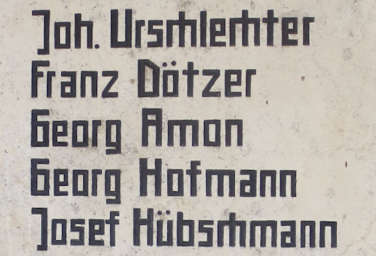
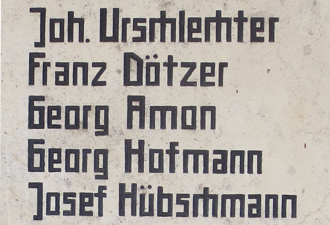
WGS84: 49.74306, 11.12948
This is a small detail from a war memorial in Weilersbach (49.74306° N 11.12948° E) erected closely following the second World War.
The whole plaque lists more than one hundred names.
As opposed to the revanchist, glorifying tone of other memorials, which were erected after the first World War,
this shows an expressionist harshness.
The font looks extremely severe. Every shape is reduced to rectangular
(except one little diagonal to distinguish D from O).
All font features that could remind of a living hand using a pen are removed.
Everything that would show the stonemason's art is avoided.
The ascenders are short and unadorned as if ducking behind a wall,
the primitive g's descender gives it the look of an open jaw.
The ch ligature (twice in Urschlechter, once in Hübschmann)
is remarkable in its simplicity. The whole design seems to state
Everybody has seen various travesties of Claude Garamond's typeface because
it is one of the favourite fonts for books. Georg Duffner (with the help of
many) has created an
OpenType Font from an scan of a 1592 cut of Garamond's roman font.
A notable difference to modern cuts is the height of the stems of lowercase letters.
This seems to be a trend, even new typefaces like the original Times Roman look
flattend in newer cuts.
 Click to enlarge